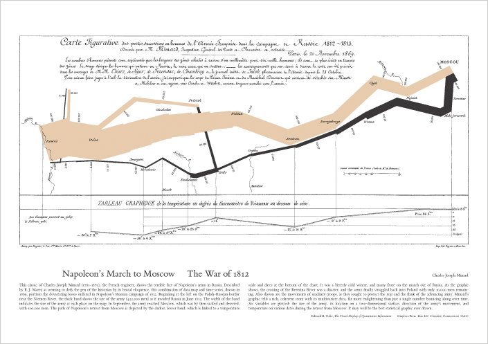
 When I was a doctoral student (20 years ago!), my adviser John Bartholdi introduced me to Edward Tufte’s Visual Display of Quantitative Information, perhaps hoping that my dissertation would be a model of appealing, provocative display. I am afraid I disappointed him: just like every other doctoral student, my dissertation contained great vomits of tables containing every piece of data I had generated over the previous years. I still find the topic fascinating, and I still find Minard’s graph of the fortunes of Napoleon’s army in the Russian campaign of 1812 an inspiring sight.
Most operations research has pretty terrible presentation. Partially this is because of the high-dimensions in which we work. Only rarely can we work in 2 or 3 dimensions and present comprehensible results. Once in a whle I see something inspiring. One recent work I saw was the EURO Gold Medal presentation of Aharon Ben-Tal. Part of the presentation involved showing how nonlinear optimization algorithms affected the design of a bridge span. The display of the span made things perfectly clear. And the visual display of moats for the traveling salesman problem is a very effective way of getting across the definition and validity of the lower bounds.
Taking some sites from outside of our field for inspiration, let me offer JunkCharts (thanks to Kaiser for providing a comment which led me to the site) and Strange Maps. JunkCharts looks at a variety of displays of numbers, offering critiques about misrepresentations and other biases. Strange Maps matches with my own interest in antique maps, but concentrates on unusual maps, often representing some other data in its geographic layout.
We could use more such creativity in operations research: have you seen something particularly effective?
Not specific to operations research, but both Tufte and Stephen Few have interesting discussion forums in their sites. I also recommend EagerEyes and Juice Analytics’ blog. If you are interested in dashboards the Dashboard Spy has an extensive collection. If you use Exel, you can’t miss Jon Peltier’s site.
And you could also take a look at my own blog. It is only one month old but perhaps you can find some interesting stuff there…
Nice to see that there are other people who like the “Tufte-Book”.
In my opinion performance profiles (from Elizabeth D. Dolan, Jorge J. Moré, “Benchmarking optimization software with performance profiles”, Mathematical Programming 91) are a good example of how one can show lots of data in a fairly simple chart. Unfortunatly, many people do not know how to read them, so if you want to use them in a 15 minute conference talk you have to spend 5 minutes explaining them…