If you are like most people, when you hear of Bernie Madoff’s Ponzi scheme ripping off investors to the tune of $50 billion, you might think “Oh those poor investors”, or perhaps “Just the rich ripping off the other rich”. If you do research in a business school, you might wonder about the institutional controls that allowed for such a long-term scam. But if you are in operations research, you probably think: what a great source of data! I wonder what I can do with that?
A couple of the results of the last question (thanks Bryan!): GeoCommons (“Visual Analytics through Maps”) have a very cool map of Madoff’s investors. While the map doesn’t contain any information that is not part of the 162 page listing of investors, the visualization leads to lots of interesting questions: why so much around Denver? Why so little in Asia? If there was one person in Auckland, New Zealand involved, is it surprising it was in Parnell? And who was that guy in Northern Canada who got ripped off, eh? (The latter appears to be a misplacement: there is a Lac Carre outside of Montreal). Other maps are here and here.

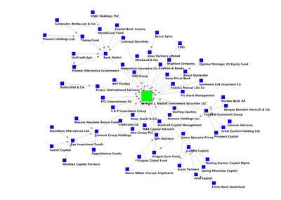
Even better is the growing analysis of the social network involved in the Madoff scam. The Network Thinker has a great graph pointing out who invested with whom (there is also an interactive map). This leads to all sorts of graph theoretic questions: what is the longest path in the graph? What do components of the graph (minus Madoff) correspond to? Are there cliques or near-cliques in the graph?
This is great data that I am sure will be used in countless dissertations over the next years. It probably wasn’t worth $50 billion to get that data, but we might as well use it now that we have it.
One thought on “Bernie Madoff and Data Visualization”