Statistics, Cell Phones, and Cancer

Today’s New York Times Magazine has a very nice article entitled “Do Cellphones Cause Brain Cancer”. The emphasis on the article is on the statistical and medical issues faced when trying to find such a link. On the surface, it seems unlikely that cellphones have a role here. There has been no increase in brain cancer rates in the US over the time you would expect if you believe cellphones are a problem:

From 1990 to 2002 — the 12-year period during which cellphone users grew to 135 million from 4 million — the age-adjusted incidence rate for overall brain cancer remained nearly flat. If anything, it decreased slightly, from 7 cases for every 100,000 persons to 6.5 cases (the reasons for the decrease are unknown).

If it wasn’t for the emotion involved, a more reasonable direction to take would be to study why cellphones protect against brain cancer (not that I believe that either!).

This “slight decrease” is then contrasted in a later study:

In 2010, a larger study updated these results, examining trends between 1992 and 2006. Once again, there was no increase in overall incidence in brain cancer. But if you subdivided the population into groups, an unusual pattern emerged: in females ages 20 to 29 (but not in males) the age-adjusted risk of cancer in the front of the brain grew slightly, from 2.5 cases per 100,000 to 2.6.

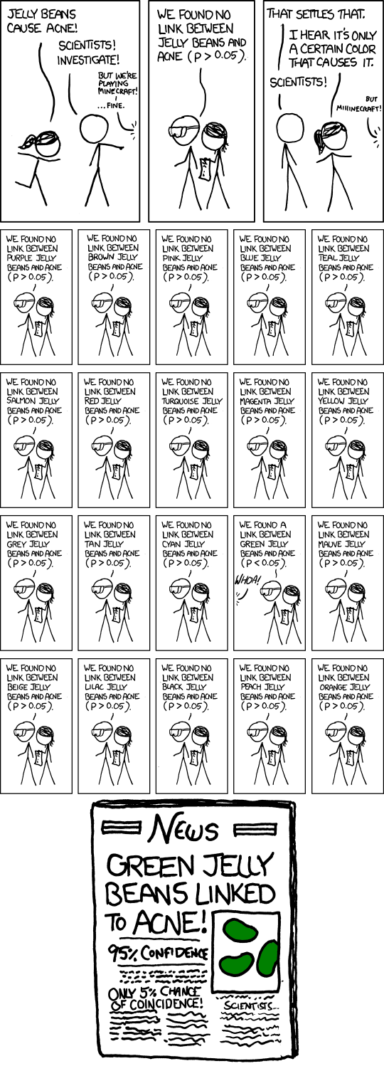
I am not sure why 7 down to 6.5 is “slight” but 2.5 to 2.6 is “unusual”. It does not take much experience in statistics to immediately dismiss this: the test divides people into males and females (2 cases), age in 10 year groupings (perhaps 8 cases), and area of brain (unclear, but perhaps 5 cases). That leads to 80 subgroups. It would be astonishing if some subgroup did not have some increase. If this is all too dry, might I suggest the incomparable xkcdIf you test lots of things, you will come up with “significant” results.

Even if the 2.5 to 2.6 was “true”, consider its implications: among women in their 20s, about 4% of the occurrences of a rare cancer are associated with cell phone usage. This association would not be among men, or women 30 years or older or under 20. I am not sure who would change their actions based on this:  probably not even those in the most at risk group!

And there are still a large number of caveats: the causation might well be associated with something other than cell phone usage. While statistical tests attempt to correct for other causes, no test can correct for everything.

There are other biases that can also make it difficult to believe in tiny effects. The article talks about recall bias (“I have brain cancer, I used my phone a lot: that must be issue!”):

some men and women with brain cancer recalled a disproportionately high use of cellphones, while others recalled disproportionately low exposure. Indeed, 10 men and women with brain tumors (but none of the “controls”) recalled 12 hours or more of use every day — a number that stretches credibility.

This issue is complicated by a confusion about what “causes” means. Here is a quick quiz: Two experiments A and B both show a significant increase in brain cancer due to a particular environmental factor. A had 1000 subjects, B had 10,000,000 subjects. Which do you find more compelling?

Assuming both tests were equally carefully done, test A is more alarming. With fewer subjects comes a need for a larger effect to be statistically significant. Test B, with a huge number of subjects, might find a very minor increase; Test A can only identify major increases.  The headline for each would be “X causes cancer”, but the impact would be much different if Test A shows a 1 in 50 chance and test B shows a 1 in a million chance.

With no lower bound on the amount of increase that might be relevant, there is no hope for a definitive study: more and larger studies might identify an increasingly tiny risk, a risk that no one would change any decision about, except retrospectively (“I had a one in a zillion chance of getting cancer by walking to school on June 3 last year. I got cancer. I wish I didn’t walk to school.”). It certainly appears that the risks of cell phone usage are very low indeed, if they exist at all.

There is no doubt that environmental factors increase the incidence of cancer and other health problems. The key is to have research concentrate on those that are having a significant effect. I would be truly astonished if cell phones had a significant health impact. And I bet there are more promising things to study than the “linkage” between cell phones and cancer.
Everyone Needs to Know Some Statistics Part n+1

I have previously written on how decision makers (and journalists) need to know some elementary probability and statistics to prevent them from making horrendously terrible decisions.  Coincidentally, Twitter’s @ORatWork (John Poppelaars) has provided a pointer to an excellent example of how easily organizations can get messed up on some very simple things.

As reported by the blog Bad Science, Stonewall (a UK-based lesbian, gay and bisexual charity) released a report stating that the average coming out age has been dropping.  This was deemed a good enough source to get coverage in the Guardian. Let’s check out the evidence:

The average coming out age has fallen by over 20 years in Britain, according to Stonewall’s latest online poll.

The poll, which had 1,536 respondents, found that lesbian, gay and bisexual people aged 60 and over came out at 37 on average. People aged 18 and under are coming out at 15 on average.

Oh dear!  I guess the most obvious statement is that it would be truly astounding if people aged 18 and under had come out at age 37!    Such a survey does not, and can not (based just on that question), answer any questions about the average coming out age.  There is an obvious sampling bias:  asking people who are 18 when they come out ignores gays, lesbians, and bisexuals who are 18 but come out at age 40!  This survey question is practically guaranteed to show a decrease in coming out age, whether it is truly decreasing, staying the same, or even increasing.  How both the charity and news organizations who report on this can’t see this immediately baffles me.

But people collect statistics without considering whether the data address the question they have.  They get nice reports, they pick out a few numbers, and the press release practically writes itself.  And they publish and report nonsense.  Bad Science discusses how the question “Are people coming out earlier” might be addressed.

I spent this morning discussing the MBA curriculum for the Tepper School, with an emphasis on the content and timing of our quantitative, business analytics skills.  This example goes to the top of my “If a student doesn’t get this without prodding, then the student should not get a Tepper MBA” list.

Added December 2. Best tweet I saw on this issue (from @sarumbear):

#Stonewall ‘s survey has found that on average, as people get older, they get older. http://bit.ly/gT731O #fail

Optimizing Discounts with Data Mining

The New York Times has an article today about tailoring discounts to individuals.    They concentrated on Sam’s Club, a warehouse chain.  Sam’s Club is a good place for this sort of individual discounting since you have to be a member to shop there, and your membership is associated with every purchase you make.  So Sam’s Club has a very good record of what you are buying there.  (In fact, as a division of Walmart Stores, perhaps Sam’s has an even better picture based on the other stores in the chain, but no membership card is shown at Walmart, so it would have to be done through credit card or other information.)

The article stressed how predictive analytics could predict what an individual consumer might be interested in, and could then offer discounts or other messages to encourage buying.

Given how many loyalty cards I have, it is surprising how few really take advantage of the data they get.  Once in a while, my local supermarket seems to offer individualized coupons.   Barnes and Noble and Borders seem to offer nothing beyond “Take 20% of one item” coupons, even though everything in my buying behavior says “If you hook me on a mystery or science fiction series, I will buy each and every one of the series, including those that are only in hardcover”.

Amazon does market to me individually, seeming to offer discounts that may be designed for me alone (online retailers can hide individual versus group discounts very well:  it is hard to know what others are seeing).

For both Sam’s and Amazon, though, I would be worried that the companies would be using my data against me.  If the goal is to optimize net revenue, any optimal discounting scheme would have the following property:  if I am sufficiently likely to buy a product without a discount, then no discount should be given.  The NY Times article had two quotes from customers:

“There’s a dollar off Bounce. I use that all the time.”

and

“[A customer]  said the best eValues deal yet was $300 off a $1,200 television.

“I remember that day,” he said later. “I came to buy food, and I bought two TVs.”

The second story is a success for data mining (assuming the company made a profit off of a $900 TV):  the customer would not have purchased without it.

In the first first story, the evaluation is more complicated:  if she really was going to buy Bounce anyway, then the $1 coupon was a $1 loss for Sam’s.  But consumer behavior is complicated:  by offering small discounts on many items, Sam’s encourages customers to buy all of their items there, not just the ones on discount.  So the overall effect may be positive.  But optimal discounting for these sorts of interrelated items with a lifetime environment is pretty complicated.

But here is a hypothetical situation (presumably):  it turns out that 25 year olds (say) are at a critical point in purchasing behavior when they decide exactly what brands they will purchase for the rest of their lifetime;  50 year olds are set in their ways (“I always buy Colgate, I never buy Crest”).  A 25 year old goes into Sam’s, hits the kiosk and walks away with 10 pages of coupons;  a 50 year old gets nothing.  Is this a success for data mining?  Perhaps the answer depends on whether you are 25 or 50!

And, more importantly for me, does Amazon not give me discounts once it is sufficiently certain I am going to want a book?

Data Mining, Operations Research, and Predicting Murders

John Toczek, who writes the PuzzlOR column for OR/MS Today  (example), has put together a new operations research/data mining challenge in the spirit of, though without the million dollar reward of, the Netflix Prize.  The Analytics X Prize is a  fascinating problem:

Current Contest – 2010 – Predicting Homicides in Philadelphia

Philadelphia is a city with 5.8 million people spread out over 47 zip codes and, like any major city, it has its share of crime.  The goal of the Analytics X Prize is to use statistical techniques and any data sets you can find to predict where crime, specifically homicides, will occur in the city.  The ability to accurately predict where crime is likely to occur allows us to deploy our limited city resources more effectively.


What I really like about this challenge is how open-ended it is. Unlike the Netflix Prize, there is no data set to be analyzed. It is up to you to determine what might be an interesting/useful/important data set. Should you analyze past murder rates? Newspaper articles? Economic indicators? Success in this might require a team that mixes those who understand societal issues with data miners and operations researchers. This, to me, makes it much more of an operations research challenge than a data mining challenge.

I also like how the Prize handles evaluation: you are predicting the future, so murders are counted after your submission. Unless you have invented time travel, there is no way to know the evaluation test set, nor can you game it like you could in the Netflix Prize (at the risk of overfitting).

I asked John why he started this prize, and he replied:

I started this project about a year ago when trying to think of ways to
attract students and people from other professions into the OR field. I
write an article in ORMS Today called the PuzzlOR which I originally
started in hopes of attracting more students to our field. OR can be a bit
overwhelming when you first get into it so I wanted a way to make it easier
for the newcomers. The puzzles I wanted to run were getting a bit out of
hand in their complexity so I needed some other place to house them.

Plus, I thought it would be good advertising for the OR field in general
and would have positive impact on the city where I live.

He’s already gotten good local press for the project. The Philadelphia City Paper ran a nice article that mentions operations research prominently:

Operations research may not sound sexy; it focuses on analytics and statistics — determining which data in a gigantic data haystack is most relevant — in order to solve big problems.

There is a monetary prize involved: $20 each month plus $100 at the end of the year. It is probably a good thing that this is not a million dollar prize. Since entries are judged based on how well they do after submission, too high a prize might lead to certain … incentives … to ensure the accuracy of your murder predictions.

Competition then Cooperation: More on the Netflix Challenge

Wired has a nice article on the teams competing to win the Netflix Prize (thanks for the pointer, Matt!).  I think the most interesting aspect is how the “competition” turned into a cooperation:

Teams Bellkor (AT&T Research), Big Chaos and Pragmatic Theory combined to form Bellkor’s Pragmatic Chaos, the first team to qualify for the prize on June 26 with a 10.05 percent improvement over Netflix’s existing algorithm. This triggered a 30-day window in which other teams were allowed to try to catch up.

As if drawn together by unseen forces, over 30 competitors — including heavy hitters Grand Prize Team, Opera Solutions and Vandelay Industries, as well as competitors lower on the totem pole — banded together to form a new team called, fittingly, The Ensemble.

In fact, with a bit more time, all those groups might have come together:

As much as these teams collapsed into each other during the contest’s closing stages, they might have mated yet again to ensure that everyone on both qualifying teams would see some of the $1 million prize. Greg McAlpin of The Ensemble told Wired.com his team approached Bellkor’s Pragmatic Chaos and asked to join forces (he later clarified that he was still part of Vandelay Industries at this point), but was spooked by AT&T’s lawyers.“We invited their whole team to join us. The first person to suggest it was my 11-year-old son,” said McAlpin. “I thought it sounded like a really good idea, so I e-mailed the guys from Bellkor’s Pragmatic Chaos… [but] they said AT&T’s lawyers would require contracts with everyone to make agreements about who owns intellectual property… and it would take too long.”

Data mining methods can easily be combined.  A simple way is simply to have algorithms vote on the outcome.  This can often result in much better answers than any individual technique.  The Ensemble clearly did something like that:

To combine competitors’ algorithms, The Ensemble didn’t have to cut and paste much code together. Instead, they simply ran hundreds of algorithms from their 30-plus members (updated) and combined their results into a single set, using a variation of weighted averaging that favored the more accurate algorithms.

This is a great example of the intellectual advances that result from long-term “competitions”.  After a while, it is no longer competitors against competitors but rather all the competitors against the problem.  I don’t know if the Netflix Challenge was specifically designed to result in this, but it has turned out wonderfully.  It is much less likely that the groups would have gotten together if the contest was simply “Who has the best algorithm on August 1, 2009”.   The mix of initial competition (to weed out the bad ideas) and final cooperation (to get the final improvements) was extremely powerful here.

The winner announcement is expected in September.

Data Mining and the Stock Market

As I have mentioned a number of times, I teach data mining to the MBA students here at the Tepper School.  It is a popular course, with something like 60% of our students taking it before graduating.   I offer an operations research view of data mining:  here are the algorithms, here are the assumptions, here are the limits.  We talk about how to present results and how to clean up data.  While I talk about limits, I know that the students get enthusiastic due to the not-insignificant successes of data mining.

We give students access to a real data mining system (SAS’s Enterprise Miner currently, though we have used SPSS’s Clementine Miner (now PASW, for some reason) in the past).  Invariably, students start putting in financial data in an attempt to “beat the stock market”.  In class, I talk about how appealing an approach this is, and how unlikely it is to work.  But students try anyway.

The Intelligent Investor column of the Wall Street Journal has a nice article on this (thanks Jainik for the pointer!) with the title: “Data Mining Isn’t a Good Bet for Stock-Market Predictions”.

The Super Bowl market indicator holds that stocks will do well after a team from the old National Football League wins the Super Bowl. The Pittsburgh Steelers, an original NFL team, won this year, and the market is up as well. Unfortunately, the losing Arizona Cardinals also are an old NFL team.

The “Sell in May and go away” rule advises investors to get out of the market after April and get back in after October. With the market up 17% since April 30, that rule isn’t looking so good at this point.

Meanwhile, dozens — probably hundreds — of Web sites hawk “proprietary trading tools” and analytical “models” based on factors with cryptic names like McMillan oscillators or floors and ceilings.

There is no end to such rules. But there isn’t much sense to most of them either. An entertaining new book, “Nerds on Wall Street,” by the veteran quantitative money manager David Leinweber, dissects the shoddy thinking that underlies most of these techniques.

The article then gives a great example of how you can “predict” the US stock market by looking at Bangledeshi butter production.  Now, I don’t buy the starkly negative phrasing of the column:  he (Jason Zweig) refers to data mining as a “sham”, which I think goes much too far.  Later in the article, he talks about what it takes to do data mining right:

That points to the first rule for keeping yourself from falling into a data mine: The results have to make sense. Correlation isn’t causation, so there needs to be a logical reason why a particular factor should predict market returns. No matter how appealing the numbers may look, if the cause isn’t plausible, the returns probably won’t last.

The second rule is to break the data into pieces. Divide the measurement period into thirds, for example, to see whether the strategy did well only part of the time. Ask to see the results only for stocks whose names begin with A through J, or R through Z, to see whether the claims hold up when you hold back some of the data.Next, ask what the results would look like once trading costs, management fees and applicable taxes are subtracted.

Finally, wait. Hypothetical results usually crumple after they collide with the real-world costs of investing. “If a strategy’s worthwhile,” Mr. Leinweber says, “then it’ll still be worthwhile in six months or a year.”

This is all good advice, and part of what I try to talk about in the course (though having the article makes things much easier).  My conclusion:  there is “sham” data mining, but that doesn’t mean all data mining is a sham.  I’d love to read the book, but the Kindle version is running at $23.73, a price that I suspect was set by data mining.

How to Design a Contest: The Netflix Challenge

It looks like the Netflix people made some good decisions when they designed their million dollar challenge. In particular, it appears that they kept two verification test sets: one that was the basis for the public standings and one that no one ever saw the results from. It is the success on the latter set that determines the winner. So BelKor, which appeared to come in second, based on the “public” verification test set, seems poised to be the winner based on the hidden test set. I put “public” in quotes, since the test set itself was not visible, but the results of each prediction on the test set was visible (as an aggregate statistic).

Why is this a good design? Any data set that gets as much of a workout as the public data set does is vulnerable to techniques that try to fit the model to that particular test set. In fact, there was discussion at the Netflix competition forum that some team or teams was doing exactly that: generating hundreds of slightly different predictions in an attempt to better fit the verification set. Such an approach, however, is counterproductive when it comes to working with a new, hidden data set. Any team that overfits the first verification test set is likely to do poorly on the second set.

So we’ll wait for official word, but it seems as though Netflix has a very nicely designed evaluation system

The Perils of “Statistical Significance”

As someone who teaches data mining, which I see as part of operations research, I often talk about what sort of results are worth changing decisions over.  Statistical significance is not the same as changing decisions.  For instance, knowing that a rare event is 3 times more likely to occur under certain circumstances might be statistically significant, but is not “significant” in the broader sense if your optimal decision doesn’t change.  In fact, with a large enough sample, you can get “statistical significance” on very small differences, differences that are far too small for you to change decisions over.  “Statistically different” might be necessary (even that is problematical) but is by no means sufficient when it comes to decision making.

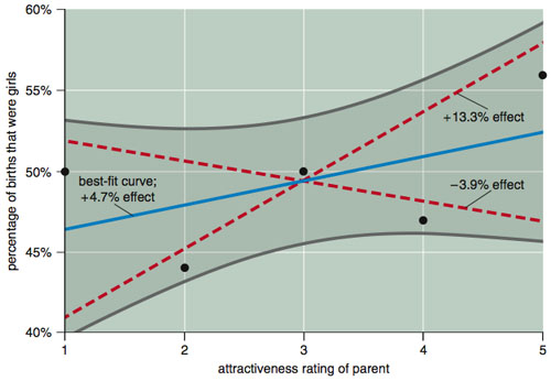
Finding statistically significant differences is a tricky business.  American Scientist in its July-August, 2009 issue has a devastating article by Andrew Gelman and David Weakliem regarding the research of Satoshi Kanazawa of the London School of Economics.  I highly recommend the article (available at one of the authors’ sites, along with a discussion of the article,  and I definitely recommend buying the magazine, or subscribing:  it is my favorite science magazine) as a lesson for what happens when you get the statistics wrong.  You can check out the whole article, but perhaps you can get the message from the following graph (from the American Scientist article):

gelman analysis of Kanazawa

The issue is whether attractive parents tend to have more daughters or sons.  The dots represent the data:  parents have been rated on a scale of 1 (ugly) to 5 (beautiful) and the y-axis is the fraction of their children who are girls.  There are 2972 respondents  in this data.  Based on the Gelman/Weakliem discussion, Kanazawa (in the respected journal Journal of Theoretical Biology) concluded that, yes, attractive parents have more daughters.  I have not read the Kanazawa article, but the title “Beautiful Parents Have More Daughters” doesn’t leave a lot of wiggle room (Journal of Theoretical Biology, 244: 133-140 (2007)).

Now, looking at the data suggests certain problems with that conclusion.  In particular, it seems unreasonable on its face.  With the ugliest group having 50-50 daughters/sons, it is really going to be hard to find a trend here.  But if you group 1-4 together and compare it to 5, then you can get statistical significance.  But this is statistically significant only if you ignore the possibility to group 1 versus 2-5, 1-2 versus 3-5, and 1-3 versus 4-5.  Since all of these could result in a paper with the title “Beautiful Parents Have More Daughters”, you really should include those in your test of statistical significance.  Or, better yet, you could just look at that data and say “I do not trust any test of statistical significance that shows significance in this data”.  And, I think you would be right.  The curved lines of Gelman/Weakliem in the diagram above are the results of a better test on the whole data (and suggest there is no statistically significant difference).

The American Scientist article makes a much stronger argument regarding this research.

At the recent EURO conference, I attended a talk on an aspects of sports scheduling where the author put up a graph and said, roughly, “I have not yet done a statistical test, but it doesn’t look to be a big effect”.  I (impolitely), blurted out “I wouldn’t trust any statistical test that said this was a statistically significant effect”.  And I think I would be right.

Netflix Prize ready to finish?

While I have been somewhat skeptical of the Netflix Prize (in short: it seems to be showing how little information is in the data, rather than how much; and the data is rather strange for “real data”), it is still fascinating to watch some pretty high powered groups take a stab at it. If I understand the standings correctly, “BellKor’s Pragmatic Chaos”, a group consisting of people from AT&T, Yahoo! Research, and two companies I am not familiar with, Commendo and Pragmatic Theory have passed the 10% improvement, which means we are now in the final 30 days to determine the overall winner. I wonder if anyone has a killer model hidden for just this time.

Data Mining Competition from FICO and UCSD

I am a sucker for competitions.  I have run a few in the past, and I see my page on the Traveling Tournament Problem as an indefinite length computational competition.    Data Mining naturally leads to competitions:  there are so many alternative techniques out there and little idea of what might work well or poorly on a particular data set.  The preeminent challenge of this type is the Netflix Prize, where the goal is to better predict customer movie ratings, and win a million dollars in doing so.  I have written before about the lessons to be learned from this particular challenge (in short:  while it might be a nice exercise, it is pretty clear that the improvements given by the algorithm would have little noticeable effect on the customer experience).

FICO (formerly known as FairIsaac) has sponsored a data mining competition with the University of California San Diego for a number of years.  The competition is open to all students (and postdocs) and have just announced the 2009 competition.  The website for the competition is now open, with a finish date for the competition of July 15, 2009.

The data involves detecting anomalous e-commerce transactions and come in “easy” and “hard” versions.  I have spent a couple of minutes with the data and it is quite interesting to work with.

I do have one complaint with this sort of data mining.  In my data mining class, I stress that you can do much better data mining if you understand the business context.  This understanding need not be overly deep, but it is hard to analyze data that is simply given as “field1”, “field2”, and so on.  For problems where creating new fields is important (say, aggregating ten types of insurance policies into one new field giving number of insurance policies purchased), if you don’t understand what the data means, it is impossible to generate appropriate new fields.  The data set in this competition has had its fields anonymized so strongly that finding any creative new fields will be more a matter of luck than anything else.

Despite this caveat, I think the competition is a great chance for students to show off what they have learned or developed.  It would be particularly nice for an operations research approach to do well.  And it doesn’t last forever like the Traveling Tournament Problem or, it seems, the Netflix Prize.