There is a lot of discussion on the role the word “analytics” should play in operations research. As a field, we have always had a bit of an identity issue. Perhaps “analytics” is the way we should go. Generally, I am supportive of this: I am part of a group that put together a “Business Analytics” track for my business school’s MBA program, and am delighted with how it resonates with both students and employers.
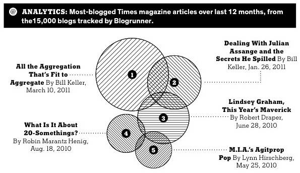
 Then, there are times where I feel we should run away screaming. Today’s New York Times Magazine continues its “Analytics” graphics with a diagram on its most blogged articles. I include a local copy here, for I truly hope that a New York Times editor will feel sufficiently chagrined to remove it from the website and, ideally, from the memory of any who gazed at it.
First, the New York Times has decided to show this as a form of a Venn Diagram. In this case, intersections should mean something. What would they mean? Since the underlying statistic is something like “blogs that mention the article”, presumably the intersection is blogs that mention both articles (or more if multiple circles intersect). But is this even possible? It appears that no blog mentions 4 articles (really? there is no blog covering essentially all of what the New York Times is doing?), and the only 3 articles mentioned by 3 blogs are articles 1, 2, and 3 (unless maybe there is an intersection with 4, 5, and 6: the diagram is not clear). Is that even remotely possible? There seem to be lots of blogs that mention 2 of the articles. I can’t believe that there is no blog that covered both #1 (“aggregation”) and #4 (“20 year olds”), particularly since there were blogs that covered each along with #3 (“Lindsey Graham”). The convenience of putting the circles from #1 down to #5 seems to have trumped any realistic representation of the intersections.
Second, this is supposed to be coverage of the last 12 months. But #1 has been out about 6 weeks, while #5 has been out almost a year. Is this raw data or is corrected for the different amount of time out? There is certainly no clue from the graphic.
Third, while there is often controversy over the space needed to graphically display relatively little data, here is a great example where much of the data is not even shown! The graphic says that it is based “from the 15,000 blogs tracked by Blogrunner”, but shows nothing about how often each article was blogged. All we get are the relative values, not the absolutes. And did they do the graph relative to radius or area? You would hope area, but without the base data, there is no checking.
If this is what “Analytics” is, then operations research should have nothing to do with it. And the New York Times Magazine editorial team had better think long and hard if they are qualified to put out “analytics” results in their otherwise admirable magazine.


 Stuart Mitchell, a buddy from my New Zealand year (and I hope soon a coauthor), passed along a neat “