Solving real problems in Norway and Ireland

A couple of weeks ago, I was in Europe and visited two different (yet similar) research groups. The first was in Oslo, Norway, where I visited the applied math group at SINTEF. I think the best US analogy to SINTEF is the RAND Corporation, a name with cold-war connotations, but still very active in providing research and analysis on public policy issues. The group I visited uses operations research approaches to solve a dizzying array of problems, most based in Norway. Some examples of what they do include clearing transactions on the Norwegian stock exchange, nurse rostering, forestry management, transportation scheduling and much more. They also provide schedules for the Norwegian Football League, so they wanted to chat with me on my sports scheduling experiences. In addition to the technical aspects, we talked about the challenges of working with sports leagues. Frustrations with sports leagues seems to be a world-wide phenomenon.

Visiting the new 4C facilities
I then moved on to one of my favorite academic-based organizations, the Cork Constraint Computation Center (4C) at the University of Cork. This center was started by Gene Freuder (one of the key founders of constraint programming) when Ireland made a very big investment in the field. 4C has grown to have more than 50 faculty, postdocs, researchers, and graduate students, so it is a very big operation. I sit on its scientific advisory board, which is great fun, since Gene has brought together some really interesting and accomplished people. During the visit, we saw demos by a number of the students, including work on natural gas purchasing, telecommunications network design, and water resource operation. 4C has spent its lifetime so far in a building by itself, but the University is building a new math and computer science building, so 4C will move into that (in the picture I am flanked by David Waltz of Columbia and Barry O’Sullivan of 4C). We did a tour of the building (hence the hardhats, something not normally needed in operations research), and the space looks fantastic.

I was struck by the similarities between 4C and SINTEF, even though one is an academic institute and one is a nonprofit research center. Both are heavily engaged with problems of practical interest and both worry greatly about funding. Since I teach in a business school, funding is not much of a worry for me (at least until the MBA students stop coming), but I envy the real problems these groups work on, and the validation they get through their interactions with companies. I get that in my own work with sports leagues, but I saw a dozen problems I wish I was working on during my visits.

On a personal note, I enjoyed Oslo very much (and I always enjoy Cork). The weather was terrible, and the prices very high (even though the US dollar had gone up quite a bit). But the food was great (even the Lutefisk, helped by the huge amount of bacon served with it) and the people were great to talk to. Thanks to my hosts Tomas Nordlander (SINTEF) and Gene Freuder (4C) for having me out.
Need for Parallelism

The operations research world is crying out for better parallel approaches to our problems. Note that for $10,000, you can buy a NVIDIA Tesla Personal Supercomputer, with speeds up to 4 teraflops (which, unless I am reading the graph wrong, easily puts it in the top 500 supercomputers at Top 500). The catch? You get the speed through hundreds of processors (processors designed for doing graphics calculations, but easily programmed for other tasks). I can see it now: “Hello ILOG? I’d like 960 licenses for parallel CPLEX! … That will be how much??” If one key part of our field is linear and integer programming, we really need to get on the bandwagon here and show how our field can take advantage of machines like this.

Of course, there is work being done, particularly by the open source wizards associated with COIN-OR, but this looks like an incredibly rich and important research area. What kind of speed up can we get with 960 processors? 500? 100? 2? Has anyone done any OR on this sort of machine?

Doing Good with Good OR

INFORMS is sponsoring a student project competition for projects having significant societal impact.  I know there is a lot of great work going on using OR to do things like route Meals-on-Wheels trucks, site ambulances, improve blood collection practices and so on.  Let’s see what is out there!  Application deadline for the competition has been extended to December 15, so get those letters in!

New OR Forum Paper on Network Science

Dave Alderson of the Naval Postgraduate School has written a very nice article on Network Science and why operations research people should be interested in it.  The paper forms the basis for an “OR Forum” discussion.  Be sure to check it out, and perhaps provide some comments on either the paper or the invited commentary.

IBM and ILOG merger cleared by EU

The EU cleared the proposed merger between IBM and ILOG.  From the announcement:

Therefore, the condition regarding receipt of all necessary antitrust clearances, approvals and decisions from the European Union has been fulfilled and there are no remaining regulatory approvals or conditions to which the tender offers are subject other than the minimum tender condition of 66.67% as set forth in the tender offer documents.

In compliance with the timetable published today by the French Autorité des marchés financiers (AMF), the tender offer in France will expire on November 24, 2008. The tender offer in the United States will be extended accordingly.

I hate to be a broken record on this (there is an archaic metaphor), but note the URL for the IBM site with information on the tender: http://www-01.ibm.com/software/websphere/ilog_investor_confirmation.html.  Websphere (aka the group interested in ILOG’s rules work) continues to play the leading role in the merger from IBM’s side, if the URL is anything to go by.

Perhaps once the tender expires, we can start hearing from IBM/ILOG on how optimization and constraint programming fits into their strategies, since legal limits on their announcements will no longer be in force.

Presenting results and the election

In operations research, we often have problems presenting our results in a reasonably provocative yet accurate way.  I swear I have spent 10% of my life sitting through powerpoint tables with the presenter saying “Well, you can’t really see the numbers but they really show my approach is better” (and perhaps I spent a further 5% of the time presenting such slides:  I am as bad as many others in this respect).   We have to do better!

My adviser, John Bartholdi, is a big fan of Edward Tufte, to the extent that I can recognize my academic brothers by the Tufte in their bookshelves (I noted it for Kevin Gue at Auburn two weeks ago).  His main message is that thinking about how to present work can be as much effort or even more than the work itself.  But it pays off in improved understanding.

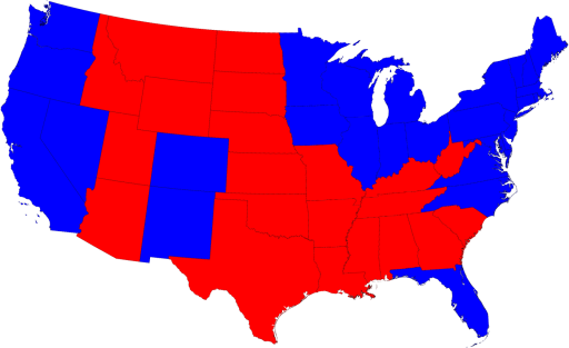
The recent US presidential election is a good example of a display challenge.  There is the simple data:  Barack Obama won the election and John McCain lost.  You can add in the “electoral college” numbers:  Obama with 364 to McCain’s 173 as I write, with one vote still too close to call in Nebraska.  But these numbers don’t give a very deep impression of the election.  Where did Obama do well?  Where did he do poorly?  The standard electoral map (like that shown at pollster.com) gives some impression (Obama blue on the coasts and around the great lakes, generally McCain red in the middle, but with some blue inroads in Colorado and New Mexico):

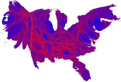
But this misses a huge amount also.  Some of these areas are highly populated, while some have very, very few people.  In the US, we don’t vote by acreage!

Mark Newman, a physicist and researcher in complex systems, has a great page on different presentations of the election.  The one I like best includes both a scaling of the states to keep their general shape but to scale them to be proportional to population and a mixing of blue and red (making purple) representing how strongly an area voted for Obama and McCain respectively:

I admit it looks a bit weird, resembling some cardiovascular system to my eyes, but Mark’s page walks us through the process.

The standard operations research talk would present this data in six-point fonts in a table that can’t be read by anyone more than 3 feet from the screen.  Perhaps when we get as good at presenting our work as the complex systems people seem to be, our field will get the respect it deserves.

Electoral College Power

There is an op-ed piece in today’s New York Times entitled “How Much is Your Vote Worth?” by Sarah Cowan, Stephen Doyle and Drew Heffron. Doyle and Heffron are graphic designers, which explains the lovely graphic:

Beautiful graphic, making it clear that the worth of a vote is far higher in smaller states. Unfortunately, the graphic (and the result) is completely misleading. The caption for the graphic is

This map shows each state re-sized in proportion to the relative influence of the individual voters who live there. The numbers indicate the total delegates to the Electoral College from each state, and how many eligible voters a single delegate from each state represents.

There is nothing wrong with the second part of this, but conflating “eligible voters a single delegate from each state represents” with “relative influence” ignores more than 40 years of research on the issue.

There are two issues to face. First, a voter in Wyoming can make a difference on only 3 electoral votes; a voter in California can affect 55 votes. Second, the need to get 270 votes to win the electoral college means a block of 55 votes has a different power than that of a block of 3. Dozens of papers have been written trying to work out the overall effect on the power of an individual voter. You can read more about this in Steven Brams “The Presidential Election Game”, a wonderful, if now dated, book (the 2007 does not appear to have updated much). A recent analysis is available at The Statistical Modeling, Causal Inference and Social Science blog, who also conclude that it is generally better to be in a small state, but not in the way illustrated by Cowan et al. (so, for instance, a DC voter has almost no influence, but an Ohio voter has high influence). Overall, depending on the assumptions you make, you will end up with different relative influences. But simply calculating the number of voters per electoral college delegate is grossly misleading.

Just to illustrate this, suppose there are only 2 states. State A has 10,000,000 voters for 2 Electoral College delegates; State B has 1 voter for 1 Electoral College delegate. The States (like all but 2 US States) are winner take all. Would you rather be in State A or State B? The corresponding graphic of Cowen et al. will show a voter in State B is hugely more “influential” than A, though only voters in state A have any influence at all in the election .

Nice graphic, but misleading analysis.