In operations research, we often have problems presenting our results in a reasonably provocative yet accurate way. I swear I have spent 10% of my life sitting through powerpoint tables with the presenter saying “Well, you can’t really see the numbers but they really show my approach is better” (and perhaps I spent a further 5% of the time presenting such slides: I am as bad as many others in this respect). We have to do better!
My adviser, John Bartholdi, is a big fan of Edward Tufte, to the extent that I can recognize my academic brothers by the Tufte in their bookshelves (I noted it for Kevin Gue at Auburn two weeks ago). His main message is that thinking about how to present work can be as much effort or even more than the work itself. But it pays off in improved understanding.
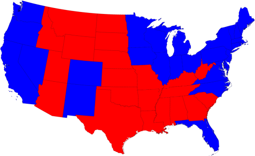
The recent US presidential election is a good example of a display challenge. There is the simple data: Barack Obama won the election and John McCain lost. You can add in the “electoral college” numbers: Obama with 364 to McCain’s 173 as I write, with one vote still too close to call in Nebraska. But these numbers don’t give a very deep impression of the election. Where did Obama do well? Where did he do poorly? The standard electoral map (like that shown at pollster.com) gives some impression (Obama blue on the coasts and around the great lakes, generally McCain red in the middle, but with some blue inroads in Colorado and New Mexico):

But this misses a huge amount also. Some of these areas are highly populated, while some have very, very few people. In the US, we don’t vote by acreage!
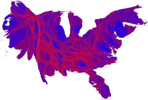
Mark Newman, a physicist and researcher in complex systems, has a great page on different presentations of the election. The one I like best includes both a scaling of the states to keep their general shape but to scale them to be proportional to population and a mixing of blue and red (making purple) representing how strongly an area voted for Obama and McCain respectively:

I admit it looks a bit weird, resembling some cardiovascular system to my eyes, but Mark’s page walks us through the process.
The standard operations research talk would present this data in six-point fonts in a table that can’t be read by anyone more than 3 feet from the screen. Perhaps when we get as good at presenting our work as the complex systems people seem to be, our field will get the respect it deserves.
 Gerard Cachon


 If you have taken an undergraduate psychology class, you probably have heard about the experiment where monkeys, having previously shown little or no preference between red, blue, and green M&Ms are offered them in pairs. First blue and red is offered, and the one not chosen (say blue) is offered against green. About 2/3 of the monkeys choose green. Psychologists claim this is a sign of cognitive dissonance: information is ignored or used selectively to confirm biases. If blue is not chosen in the first round, it must be “bad”, so it is less likely to be chosen in the second round. Not so fast! If the monkey does have a preference among the colors, then perhaps the monkey is acting consistently. There are six choices for an ordering of the colors: